Client’s Vision:

Company:

BonVoyage Aesthetics & Body

Project:

Logo Design

Type:

Design

Platform:

Google Business & Website
Step 1: Discovery & Concept Development

We began the process with a consultation to fully understand BonVoyage’s values, target audience, and design preferences. Key points from this phase included:

  • Brand Values: Luxury, elegance, precision, and wellness.
  • Target Audience: Professionals seeking high-end aesthetic and body services.
  • Client Request: A minimalist design with clean lines and a modern feel. The logo should incorporate a “B” as the central focus.

Step 2: Rough Drafts and Exploration

Using the client’s rough sketch as inspiration, we brainstormed multiple concepts:

  • Typography: Experimented with clean, sans-serif fonts for a modern touch.
  • Symbolism: Focused on creating an abstract “B” shape that incorporates smooth lines, symmetry, and flow to represent the beauty and wellness journey.
  • Color Palette: Explored neutral tones (gray, white) to reflect professionalism and sophistication.

Step 3: Refinement

After presenting three initial concepts, the client selected one for refinement. Here’s what we refined:

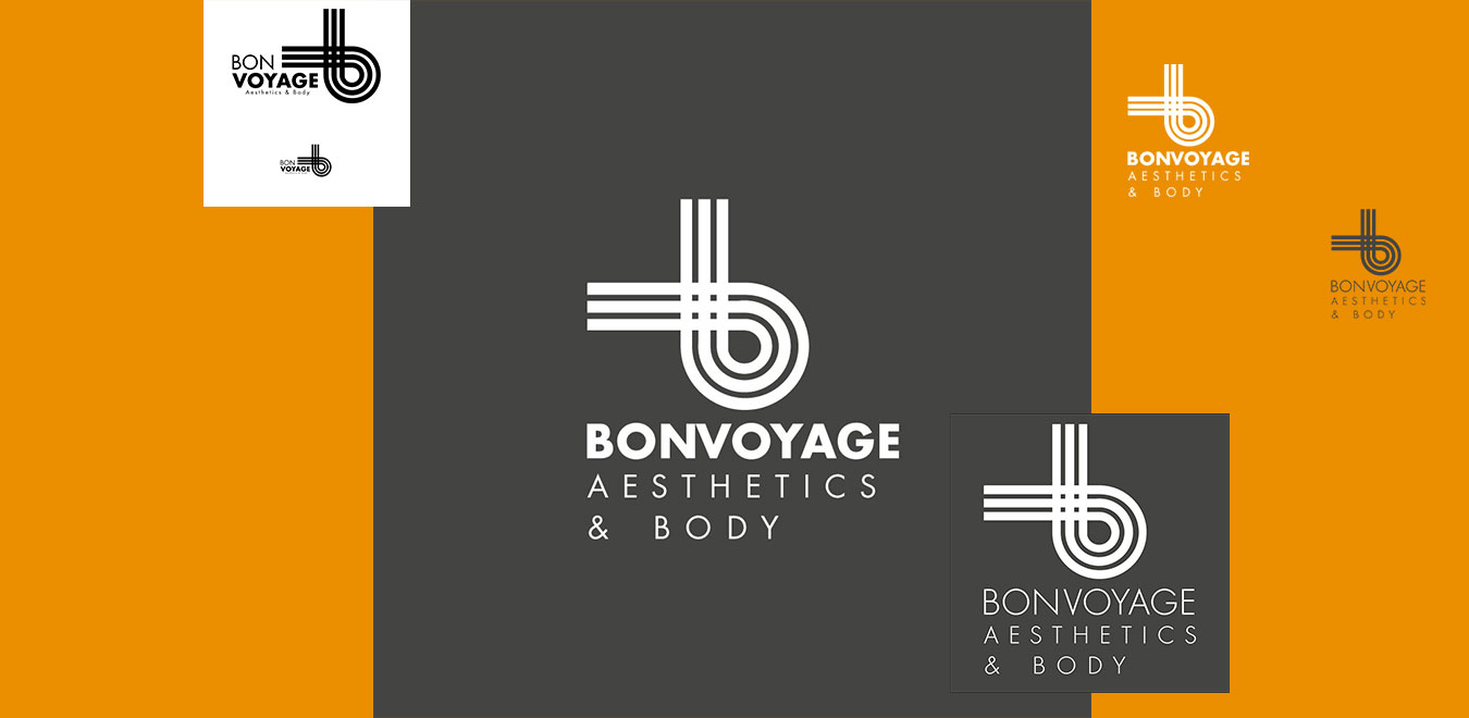
  • Line Work: We adjusted the curvature of the “B” to create seamless loops, symbolizing harmony and balance.
  • Spacing: Balanced the proportions between the icon and typography to ensure scalability across print and digital mediums.
  • Typography: Opted for a bold sans-serif font for “BONVOYAGE” paired with a lighter font for “AESTHETICS & BODY” to create a clear hierarchy.

Step 4: Finalizing the Design

The final logo features:

  • A Unified Icon: A custom-designed “B” that incorporates intertwined loops, representing the interconnected nature of wellness and beauty.
  • Simplicity & Elegance: The minimalist design ensures versatility across mediums, from signage to digital branding.
  • Neutral Color Palette: The gray background and white logo create a timeless and professional look.

Step 5: Delivery & Application

The logo was delivered in multiple formats (JPEG, PNG, SVG, and EPS) for versatility. We also provided mockups to show how the logo would appear on business cards, signage, and social media.


Best Practices Followed:

  1. Client Collaboration: Regular feedback sessions ensured alignment with the client’s vision.
  2. Simplicity: Focused on a clean, timeless design for long-term usability.
  3. Scalability: Ensured the logo works well across all platforms, from small icons to large banners.
  4. Symbolism: Incorporated meaningful elements that align with the brand’s mission.

Outcome:

The client was thrilled with the final logo, which perfectly encapsulates their brand identity. The sleek design has been seamlessly integrated into their website, marketing materials, and physical location, enhancing their professional image and brand recognition.

Follow Us:

Client’s Vision:

Company:

Sky Bistro Lounge

Project:

Logo Design

Type:

Design

Platform:

Business & Website
Step 1: Discovery & Ideation

We started with a detailed consultation to understand the brand’s core values and target audience. Key insights included:

  • Brand Values: Modern sophistication, approachable luxury, and a creative dining experience.
  • Target Audience: Urban professionals, food enthusiasts, and individuals seeking a premium dining atmosphere.
  • Design Preferences: A clean and modern aesthetic with emphasis on the word “Sky.”

Step 2: Concept Development

Using the insights from the consultation, we explored the following elements:

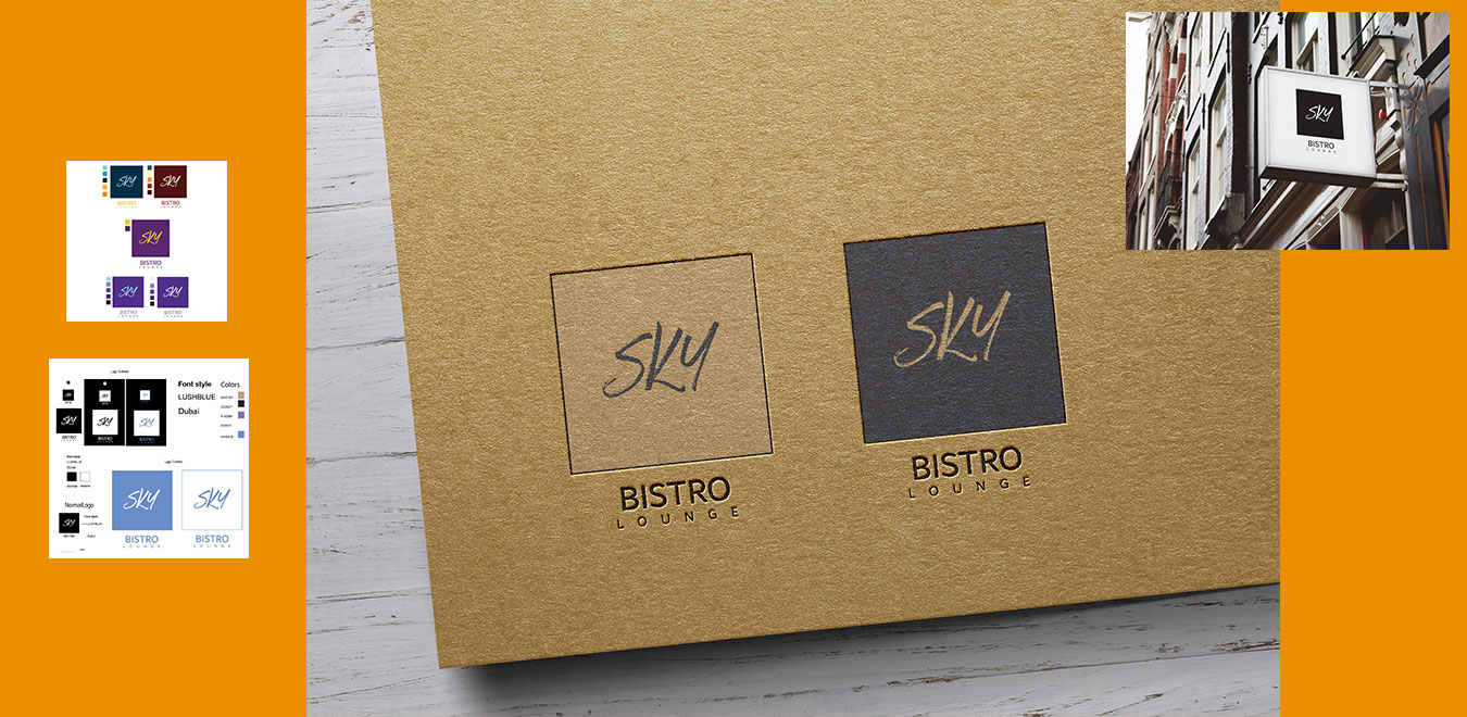
  • Typography: Experimented with a handwritten script for “Sky” to add a personal, creative touch, paired with a clean, sans-serif font for “Bistro Lounge” to balance elegance with clarity.
  • Color Palette:
    • Chose neutral tones (black, white) for timeless sophistication.
    • Added a soft blue (6A8DC8) for an airy and calming vibe, symbolizing the “Sky” theme.
    • Incorporated complementary accent colors like beige (BAA180) and purple (916EB0) to add depth and versatility.
  • Structure: Designed a logo that could work in multiple layouts (square, outlined, and horizontal) for flexible application across branding materials.

Step 3: Refinement

From the initial concepts, the client chose the handwritten “Sky” design for its uniqueness. We refined the design with:

  • Alignment & Proportion: Balanced the “Sky” script with the structured text of “Bistro Lounge” to ensure harmony.
  • Spacing Adjustments: Optimized spacing between elements to maintain readability across different scales.
  • Color Testing: Ensured the colors worked well on both dark and light backgrounds, making the design versatile for signage, menus, and online platforms.

Step 4: Finalizing the Logo

The final logo incorporates:

  • Handwritten Typography: The playful yet elegant script of “Sky” captures creativity and approachability.
  • Sans-Serif Typography: The clean and modern font of “Bistro Lounge” reinforces professionalism and luxury.
  • Flexible Layouts: Delivered in outlined, normal, and stacked variations to suit multiple applications.
  • Color Palette: A mix of calming blues and neutrals to create a balanced and luxurious feel.

Step 5: Delivery & Application

The logo was delivered in various formats (JPEG, PNG, SVG, and EPS) and mockups were provided to showcase the design on:

  • Signage: Outdoor and indoor applications.
  • Menus & Tableware: Elegant placements on printed materials.
  • Digital Platforms: Optimized for social media, website headers, and email marketing.

Best Practices Followed:

  1. Brand Alignment: Ensured the design reflects the brand’s personality and audience preferences.
  2. Versatility: Delivered multiple layouts and color options for seamless integration across all platforms.
  3. Modern Simplicity: Focused on clean and timeless aesthetics to ensure longevity.
  4. Client Collaboration: Incorporated client feedback at each stage to achieve their vision.

Outcome:

Sky Bistro Lounge was thrilled with the final logo. The design has become a key part of their brand identity, featured prominently across their physical and digital presence, reinforcing their position as a premier destination for dining and relaxation.

Follow Us:

Client’s Vision:

Company:

FourMars Space Mining Company

Project:

Logo Design

Type:

Design

Platform:

Business & Website
Client’s Vision

FourMars, a forward-thinking space mining company, sought a logo that would embody their innovative spirit and pioneering approach to mining operations across Earth, the Moon, Mars, and beyond. They emphasized the need for a modern design that would reflect the technological edge and ambition of their brand while remaining approachable and versatile for diverse applications.


Step 1: Discovery & Concept Development

We began the design process with a detailed consultation to uncover the core values of FourMars:

  • Core Values: Innovation, exploration, and sustainability in space and terrestrial mining.
  • Target Audience: Investors, scientists, and space exploration enthusiasts.
  • Client Requests: Incorporate elements symbolizing space exploration, advanced technology, and a multi-planetary presence.

From the consultation, we developed key design goals:

  • Use of a circular motif to signify inclusivity and planetary systems.
  • Incorporation of vibrant, contrasting colors to symbolize technological advancement and interplanetary exploration.

Step 2: Design Exploration

We created a series of initial concepts focusing on:

  • Iconography: A stylized depiction of planets, space mining gears, and exploration routes.
  • Typography: Modern, bold fonts for “FOURMARS” paired with smaller, structured text for supporting details like “Space Mining Company.”
  • Color Palette:
    • Teal Blue (Technological Advancement): Represents innovation and the sky.
    • Warm Orange (Exploration): Symbolizes ambition and new horizons.
    • Neutral Black and White: Adds a timeless, professional touch.

Step 3: Refinement

After presenting the concepts, the client selected a design featuring:

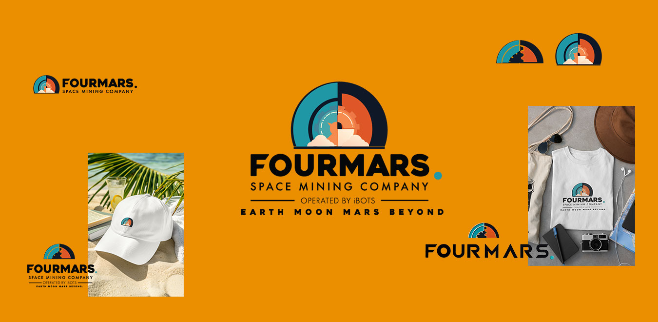
  • Central Icon: A circular design split into four quadrants, each representing a different aspect of the brand’s operations.
    • Teal Blue and Orange Quadrants: Represent Earth and Mars.
    • Central Gear Motif: Symbolizes the machinery and technology of mining.
    • Dynamic Lines: Represent planetary orbits and exploration routes.
  • Typography Adjustments: We refined the text hierarchy, ensuring “FOURMARS” remained dominant while “Space Mining Company” provided context.
  • Slogan Integration: The tagline, “Earth, Moon, Mars, Beyond,” was added for clarity and ambition.

Step 4: Application & Testing

The logo was tested across various mediums:

  • Merchandise: Successfully applied to T-shirts, hats, and other promotional items, maintaining clarity and impact.
  • Digital Platforms: Optimized for use on websites, social media, and presentations.
  • Physical Signage: Scalable for large-format applications such as office signage and event banners.

Step 5: Delivery

The final logo was delivered in multiple formats (PNG, JPEG, SVG, and EPS) and variations:

  • Full-color version for digital use.
  • Simplified monochrome and outlined versions for versatility.
  • Mockups to demonstrate the logo’s adaptability across merchandise and marketing collateral.

Outcome

The FourMars logo perfectly captures the company’s vision of interplanetary innovation and advanced technology. It is now prominently featured on the company’s branding materials, creating a strong visual identity that resonates with their audience and partners.

Follow Us: